SEE-mantic UI
22 Feb 2018HTML and UI Frameworks: An Introduction
One of my biggest dreams and aspirations for my computer science degree was to learn how to build a highly functional and visually appealing website to help someone or something. However, I never had any prior experience building one. When I found out in my Software Engineering class that we were going to learn HTML and CSS I was thrilled. UI Frameworks such as Semantic UI helps me to fulfill that goal as with the use of certain keywords (such as icon or menu), it gives easy access to providing a very attractive and appealing website without having to do much styling at all.
Semantic UI: The Struggle
Semantic UI gives so many different options to make a website more user-friendly and appealing. It allows you to add menus, dropdown items, containers for formatting, and even common icons. However it does not come without its share of struggles. Because one has to first implement the class libraries it can be easy to forget, especially if previous projects have used it. Personally for one of my class assignments I couldn’t figure out why nothing was loading before I realized I had forgot to implement the library.
The biggest challenge comes from having to learn the keywords and what each keyword means. For example, to add a container in the html file one would have to code:
<div class="ui container"></div>
There are many other class names that are similar to this. For example, one can add the keyword “fluid” to the above class to create a container that would encompass the entire page. Also one could create a custom subclass that could then be styled using CSS. Luckily Semantic UI has a website that gives the source code that can be used to implement all of its features, which is very helpful when trying to find the specific function within Semantic UI.
One other struggle that comes with UI Framework design comes with styling and formatting all the elements using CSS. The spaces rule (differentiating between .classA.classB and .classA .classB) tripped me up when it came to changing the color of fonts. Also just getting used to the whole CSS formart of styling coupled with Semantic UI is a struggle. Font sizes, color, background color, text alignment, etc. are all much easier to style in raw HTML rather than Semantic UI.
Semantic UI: The Payoff
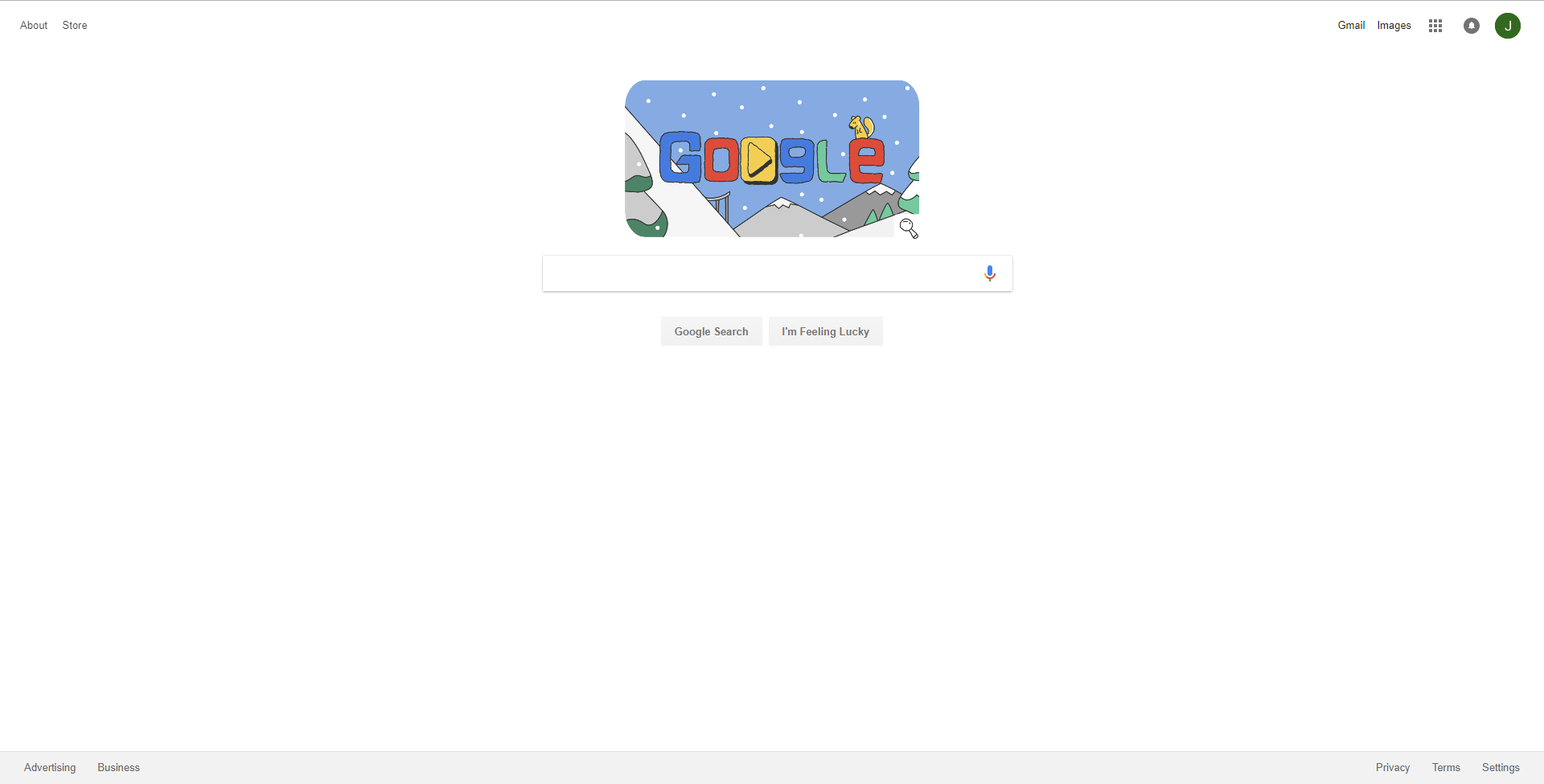
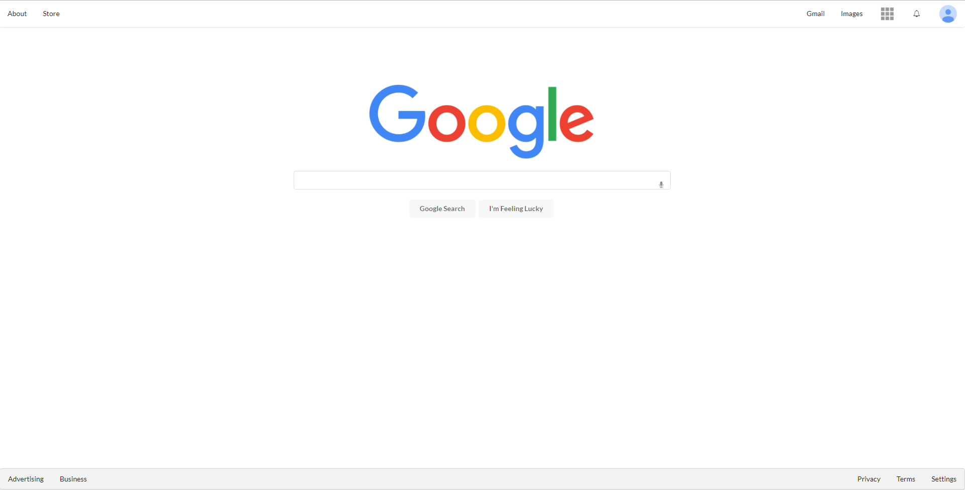
Despite all of the struggles and while there is initially a big learning curve for Semantic UI, the payoff is actually quite amazing. Semantic UI allows almost perfect recreation of many websites. For example, I was able to recreate the UI of Google.


The original is the top image, and the remade is the bottom. I had not yet learned how to insert animations into an html document yet, which is why there is no theme on the remade page. Otherwise the products look quite similar and it is impressive how Semantic UI allows the user to almost perfectly recreate other webpages. All of the icons in the remade version are from Semantic UI’s icon library, and creating different containers that were fluid allowed me to balance out the webpage as fit.
Semantic UI: The Verdict
I have created other mockup websites as well, such as Murphy’s Bar and Grill, Hard Rock Cafe, and Island Snow. However the biggest payoff of Semantic UI is not creating mockups. It is the ability to KNOW how to recreate it. When a user sees a website that stands out to them, Semantic UI can be easily implemented to recreate it. Dropdowns, menus, icons, the ability to style to your heart’s consent are just some things that learning UI Frameworks allows one to do to their websites. As Semantic UI also provides the sample code that allows for easy implementation, it almost feels as if you are “cheating” to make the website. Semantic UI provides all the formatting and layout. All the user has to do is style to their heart’s content. While the initial learning curve may be similar to that of a new programming language as it is filled with many new keywords, the payoff is huge for creataing a very user-friendly and visually appealing website.
